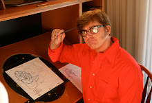
 here is another try... I tried to be more accurate in this one and follow the adivices given by mr. John K.
I don't think it is good yet, but at least it looks better than the last one.
Ideally it should be more caricatured, but I don't think I was able to get right in this point.
that is it..
Happy new year for everybody!!!
until 2010 :)

Here goes my second try on Yogi's toy.
I tried to caricature it more and to give more contrast between the soft areas and the rest.
I think that it looks better than my first try... but it could have more appeal and more contrast between filled areas and empty space... what makes some parts of the drawing hard to read.
It is good to see that everybody are working hard.
abraço
davi

what is making your finished line look so grainy? Are you using rough textured paper?
ReplyDeleteYou are adding lumps where they don't exist.
The point is to make the drawing feel like the object
the object is mostly smooth, and the wrinkles are puffed up and stretched really tight around the big shapes
you need to maintain the overall shapes of the object, not change them
look at the shapes of the legs for instance
they are very distinct
your drawing of the legs are completely different; they aren't an exaggeration of the actual shapes, they are just lumpy
details like wrinkles should be kept small and not interrupt or distract from the bigger shapes they are part of
your drawing does not feel like a balloon. It feels like a crumpled paper bag
I think the line is grainy because of the 6B pencil and the surface of the desk that I was drawing.. I will make the lines cleaner in the next.
ReplyDeleteThis exercise is hard but it is helping me to understand construction even if is still full of mistakes.
I want to repit it until you say that it is right.
I will try again tomorrow.
thank you very much.
too lumpy
ReplyDeleteyou are losing the big shapes