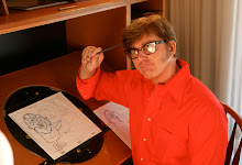
Here's my take on the Slab's First Fist layout exercise.

Hope these are okay. They aren't fully cleaned up though.
I wanted to see if I was going in the right direction before I kept going and wanted to hear everyone's thoughts.
I tried maintaining the guts on some of these from the storyboards. I think overall I did fine. There are some problems I noticed like some things are slightly toned down and I had some problems spacing the characters within the background like the ladder being to close to Ernie as well as too close to the edge of the paper.
I also tried maintaining a good flow between each pose so that they consecutively flip properly.

I remember reading a post that John did in his blog about how Irv Spence designed the eyes on some Tex Avery characters where their eyes don't follow the center line on the head without making them look flat. Here's the post I'm talking about.
I tried dong so with Slab and Ernie's eyes in most of these layouts so to attract the viewer to their expression in their eyes like the one Ernie has above, which I think was John's intention when he did the storyboard.
Doing this also helped the drawing retain the guts from the storyboard drawing.

With this last layout below I analyzed from the storyboard drawings that these last poses took up almost the whole spacing of the BG, so this is the layout I drew first while I visually planned out how the other poses from the other storyboard drawings would fit into that final spacing of the BG.

As I did the other layouts, little by little I started changing certain things in the BG like raising the top bed for Slab's big fist to fit in better or adjusting the steps on the ladder, so that all the poses read clearly alone as well as read clearly and make sense within the background.
I don't know if that was exactly the correct way to go about it, but it seemed to make sense to me.
Let me know what you think! If anything doesn't make sense let me know.

everything's been evened out
ReplyDelete