I have drawn the same poses again to try to fix the mistakes.
I hope it had improved. I will draw more Kaspars tomorrow.
thanks for the advices Professor.
More Kaspar studies.
I don't feel that I am getting it right.. it seems to me that is better than the first ones that I made.. but still is not as funny as the original layouts..
I analyzed the emotinal statement and read the story a couple of times in the "JK STUFF" blog to see if I get what is going on in the drawing.
my self critiques are:
first one - there is a weird angle in the chest (I just saw it now) that goes in the oposite direction of the original drawing, the eyes are too separeted, and the hands are too high, the underware needs to be more organic.
second one - I think he has too many circle shapes in my drawing, maybe it would look better it he had more straight lines, specially from the chin to the belly. The hands are very diferent from the original, I don't know if is out of his model.
What I've done here is basically the same thing I did to the last Pixie and Dixie drawing:
-Make my copy better than the original
-and slightly change certain specific features on the characters so that their actions, along with their emotions, can stand out more.
This one was kinda tricky for me though, because I hardly couldn't find anything that I wanted to change from the original. To me the original is perfect the way it is.
But I figured I'd try doing some changes to it, so It seemed like a good challenge.
There was one thing that stood out for me as far as wanting to slightly change something from the original, and that was Tom's head. Not the head alone, but the placement of the head.
In the original he looks content, relaxed. Sitting next to the fire, catching its warmth, while knowing that there's peace between him and his two micey brethren.
So in order for me to make that emotion stand out more I had to change some of Tom's physical features.
1. I wanted his head slightly moved up at a northwest angle so it can seem less cramped next to the fireplace.
2. Elongate his neck more so that his shoulders seem more relaxed.
These changes, I thought, would add more to Tom's relaxed state.
So here's how I did the entire thing.
First, I put the overall shape where all the characters would fit in and added the fireplace.
I fixed my proportions and perspective (shown below), and added the construction to all the the characters. I also kept in mind of the small changes I wanted to make.
I added more to the fireplace for more solidity and added the overall shape of the logs. The pipe and pillow were also added.
I tighten the drawing more (below) and add more of the secondary features to the characters and objects.
I add perspective lines to where the bricks will be placed.
I continue adding more details to the characters (below), finishing up with Tom.
I put in the overall shape of the fire inside the fireplace and add the overall shapes of the fire and smoke coming out of the two ends of the pipe.
I fixed my proportions, add the final details, and here's the final copy shown below
Some parts look fairly accurate, but I think I made a lot of errors here.
Proportions are slightly wrong in some areas, especially Tom's head. The shape seems a bit more obscured than the original. Almost stretched I think.
I don't think I added more to Tom's relaxed state too. I think I just made his neck longer while everything else still feels the same. Now It just seems like he's trying to catch more of the fire's warmth.
I think I should've just relaxed more his shoulders, making them slightly less rounded at top, with no long neck and head being in the same place like in the original.
The rest of the errors are kinda minuscule:
-I made Tom's eybrows a bit too bushy.
-Made Jerry's head too circular. It's actually slightly egg-shaped.
-Had to make Jerry's belly more round
-Made Tuffy's nose the same size as Jerry's.
-Smoothed out Tom's torso where the bump is, where part of his rib sticks out
-Move the line on the backside of the pipe a little to the left.
I don't know, I might be wrong about this. I'd like to hear what you think.
Hey, everyone. I bring you another Eisenberg study.
I wanted to try something a little different here. Instead of actually copying the entire drawing down with 100% accuracy, I wanted to make my copy seem a bit better than the original, which was the key thing for me to remember as I did my version.
Eisenberg is a true genius of cartooning and I don't want to make it seem as if I'm a better drawer than he is, which I'm totally not, but I felt like I could top his drawing a little by fixing a couple of subtle things. They're pretty much just different placements of objects in certain specific positions that would make the entire drawing read more clear.
I jotted those changes I wanted to make down on my paper:
1. I wanted to make the cowboy seem more proud that he's riding Mr. Jinx than how he's originally portrayed. He seems pretty happy that he was able to ride a cat, with him being a mouse and all, so I really wanted to make that stand out.
2. Make Pixie and Dixie's head less cramped together. Eisenberg, I'd imagine, had to do it like that in order for the other cat's word bubble to appear in the panel, but since I was excluding the word bubbles in my copy I figured I'd make both there heads seem less cramped together so that they both read clearer.
3. Adding more of of a curve to Mr. Jinx's line of action so that his pose had a bit more life into it. I also figured that that would add to more to the cowboy mouse's proudness.
Here's how I did the step by step procedure:
First I put down the general forms. All the characters together create one big shape. The chair was made into another.
I also added the lines that shape the wall and the floor and the two cats' line of action were added. I checked them in PS and fixed the proportions
I then added the general construction of all the characters, but I still kept in mind of all the little subtle changes I wanted to make.
The muzzles, ears, hat, tail, arms, legs, hands, feet and fur of both cats are sub forms for their general construction.
I fixed my proportions and made the drawing a bit more tighter. I also added more details to the chair and mice
I put both saddles and straps on the two cats and added Mr. Jinx's bow tie.
Here I raised Mr. Jinx's bum more up so that his line of action could curve more and moved Pixie's head a slightly bit to the right from Dixie's.
I elongated the cowboy mouse's body to add more to his pride and tilted his head a little upward.
I still kept in mind that the construction and placement of the objects that weren't changed had to be accurate to the original and that the things that I changed had to fit with the construction of the characters in the original, except for the elongation I added to the cowboy mouses torso.
I fixed what I needed fixing and added the final details to the cats like eyes, nose, muzzle, fur, tie, ears, hands and feet. I forgot the other cats tail in this one.
I added arms and legs to all the mice.
fixed proportions
I notice when I finish a drawing that perspective is one of my biggest flaws.
As I kept building each character in my Eisenberg copy I noticed how Eisenberg doesn't keep the perspective on certain objects constrained. Well he does, but not by normal perspective standards. It's cartoon perspective, but with control. He knows how each object and character is rounded according to both real life perspective and cartoon perspective.
That's how I see it at least.
I build more details to all the mice as I continue to fix certain things.
I noticed Dixie's head is a lot more angular and Pixie's is more circular. That helps me realize that they don't look exactly alike. There are subtle differences in there head shapes (and eye shapes) that makes them seem more different from one another so they won't look like exact copies of each other.
And here's the final piece. I was able to arch more Mr. Jinx's line of action, show more pride in the cowboy mouse, and get rid of the cramped space between Pixie and Dixie's head.
I changed eye directions for both Pixie and Dixie so that one is looking directly at the cowboy and the other is looking directly at the saddle on Mr. Jinx.
I feel like everything now seems more clear while it still retains the same feel that the original gives.
There are, of course, some little mistakes in proportion like Pixie's head being little bit squashed on the right side as well as Dixie's, but other than that I think it came out fine.
Tell me what you think! I f you didn't understand something let me know and feel free to critique this.
I think I'm going to do a much more harder drawing for the next one. One with a good sense of perspective.
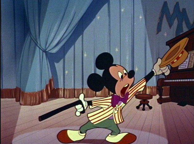
I really like this picture of Mickey. John's posted a few on his blog that are obviously from the same source, and they're all so fantastically cute. I am interested in figuring out this cute trickery and stealing it for my own questionable purposes.
I don't think I did too bad of a job! I checked my errors just the right amount of times, drew LARGE, drew with a regular mechanical pencil, had a really clear b/w print of the reference.
Of course, there are still some errors... the cane is at a slightly wrong angle, the viewer's left leg is too thin, there are some small accuracy issues with the hands, and I stretched the bow tie a bit. I didn't push the mouth shape far enough-- it just needs to be "more." More back, slightly wider open, etc.
There are some wrinkle inaccuracies in the main curtain shape, and I only noticed this upon scanning but I ACCIDENTALLY MADE EVERY CURTAIN FOLD VEER TOO FAR TO THE RIGHT. I have no idea how that happened.
Also, pianos, particularly when they are submerged in darkness, are really hard to draw. I misinterpreted some angles again, there, but I was surprised how much easier the shapes were to handle with some good ol' hierarchy.
Maybe one day I'll learn to see angles correctly. Haha.
Anyway, I've done other stuff, too, but I feel kinda sheepish making a ton of posts here. You guys annihilate me, but I wanna make it clear that I'm participating!
Click here to read me blather on about making these two studies.
(6:37:47 PM) John K: try copying some more of those Mickeys without worrying about 100% accuracy (6:37:53 PM) Geneva: okay (6:38:04 PM) John K: aim for understanding the principles instead (6:38:08 PM) John K: and get flow into them (6:38:21 PM) John K: then try your own poses (6:38:24 PM) John K: like Paul did (6:38:37 PM) John K: I wanna loosen you up a bit (6:38:45 PM) John K: get some real pencils! (6:39:02 PM) John K: mechanical pencils are for 'mos (6:39:08 PM) Geneva: haha, do I need anything special or just regular yellow #2? (6:39:20 PM) Geneva: well, that'll come to an end then (6:39:22 PM) John K: well start with those (6:39:33 PM) John K: you might wanna try b pencils and 2 bs too (6:39:51 PM) John K: the softer the pencil, the more flowing your poses will be (6:40:05 PM) John K: but you can't clean up easily with soft pencils (6:40:36 PM) John K: but you should see a difference in your flow right away
(6:41:34 PM) John K: you should write notes on things that you learn (6:41:49 PM) John K: like how a mouth works-how it attaches to a jaw, etc. (6:41:58 PM) John K: anything you notice about how things work (6:42:12 PM) Geneva: Ok! (6:42:26 PM) John K: that helps you to understand the concepts (6:42:46 PM) John K: and then makes it easier for you to apply them to your own work
(6:43:37 PM) John K: the best drawings come from a combination of the eye and the mind (6:43:50 PM) John K: does that make sense? (6:43:53 PM) Geneva: Yes sir (6:43:58 PM) John K: ok, cool (6:44:03 PM) John K: you're doing great (6:44:25 PM) John K: do more mickeys until you understand how he's built (6:44:31 PM) John K: then draw your own poses
I decided to do a private blog for the cartoonists who are really serious about learning to draw funny cartoons.
If you have been invited, it means you have already shown that you are serious by doing many of the lessons and applying the critiques. It also means I think you are very talented. The combination of natural talent and actual study of real principles will make you functional.
FUNCTIONAL is much more important than mere talent. It means you can get out of your sketch books and into actual cartoon making - with stories and characters and personalities and continuity.
There are certain skills that I need to make my kind of cartoons and here are the main ones:
Construction:
This is number 1. All other skills will be made easier if you conquer this.
You need to be able to draw characters that can turn around in space and that have perspective.
Line Of Action:
Each character should have a definite direction in his or her pose. The construction flows along the line of action. Hierarchy:
This is an extension of construction. It means you have a structured plan for anything you do - a story - a character -a composition - a song - and then that structure has levels of parts that fit within the structure without contradicting or cluttering the main idea.
Composition:
Your characters should fit within the background in a way that: 1) draws the attention of the viewer to what's important in the scene,
2) is appealing for its own sake
You should be able to see the overall composition easily, whether you have a lot of detail or only a little.
Appeal: I like cartoons that look nice, are cute even when they are supposed to be gross or funny. Part of appeal comes from good construction and drawing skill, part from natural flair and talent. The combination of the 2 is unbeatable.
Style- angles against curves- variety of shapes, asymmetry:
Style isn't drawing flat, like so many cartoon studios today think. It's having control over a variety of types of shapes, contrasts and the other principles of control. When you have control over everything, then your personal style can shine through.
______________________
Part of my reason for giving away free training is selfish. The kind of cartoons I make require these skills, and I can't afford to teach them during a production. Cartoon budgets go down every year and so I need people who already understand what I'm looking for and are functional.
I always want to do layouts in my cartoons - it's what separates my cartoons visually from so many others, but layout is mostly not done anywhere anymore. Nowadays, they just design the characters from a couple different angles, take them into Flash and then move the still pieces around like paper doll puppets. I can't make my kind of custom stories and acting using that system.
I need talented and SKILLED people to help. It's worth it to me to help out before a production begins, but it will be up to you to practice and apply and critique yourselves according to what you learn. I will give some critiques and everyone here can learn fro each other's studies.

 I have drawn the same poses again to try to fix the mistakes.