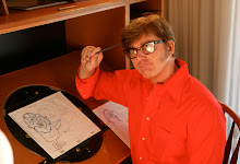
Here I wanted to feel the drawing out and combine that with my knowledge of the drawing principles so that my copy can look and feel as good or better than the original.

I tried to remember that certain contrasting objects should stand out more so they can accentuate the focal point better.
Below I mapped out some construction.
I should've included the guy's floating hat to show the overall shape.

Baby Huey is huge so I wanted to slightly exaggerate certain features he had to really show his hugeness.
I exaggerated his tummy area making it bigger and rounder, made his head a bit bigger and shortened his legs a bit.
He's not the focal point though. The big tire is what draws our attention the most, so I made it bigger than how it's originally shown.
I also took consideration of the proportions in the original so that my copy won't look too different from the original.
I accentuated the tire more by adding a farther perspective to the front of the car and made the duck guy driving it smaller.
I really wanted to instantly send the message that a big baby has immensely blown into a tire of a car that's smaller than him, which basically is telling you that he's a big strong baby and accidentally blew the tire too big.
This was a really good practice for accentuating the focal point while other objects surrounding it support it. This way I think made my copy look and feel as good or better than the original.
Below is the final drawing next to the original for comparison.

There's some stuff that needs some fixing.
I think I made the part of the tube in between his mouth and hand a bit too thick.
Raise the duck guy's hat a bit up so that the overall shape of the entire thing can be more noticeable.
Probably turn BH's head slightly more inward to his left side so that he's looking more directly at the tire.
I could've made the rear end of the car smaller to accentuate more the tire.
Other than that I think it came okay.
On this second one below I didn't really accentuate too much of anything here, but I did want it to feel and seem as good as the original.


Here's the final

The feel is pretty much there but I did tone down some things.
I made the ball on the ground a bit too small and tones down the focal point, which is the ball itself.
I could've thinned out a bit BH's neck and make it a bit longer
Made the truck seem more slim than the original in the body.
But I think it looks fine overall.

You are AMAZING! These look perfect!
ReplyDeleteCheers!
~Becky